Below are a few images from another coastal foray including what appears to be a white pointer making its way along the rock face.
Enter spring...

No doubt there will be some chilly mornings still to come but the plant life certainly knows the change of seasons. Making use of the Zeiss 120mm macro. An excellent portrait lens as well.
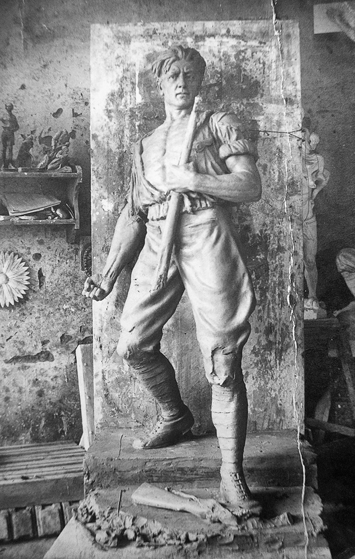
Delving into the past
Not sure when this photo was taken. My grandfather was a sculptor - brought up in Russia until moving to Hungary I think in his late 20s (early last century). Had more talent than me. I would have liked to ask him about his development as an artist or even watch him as he worked. Alas... In his later years, after moving to Australia in the 50s he took to painting and knocked out some landscapes with oil as well as pencil drawings. I was a bit young to ask sensible questions while he was still alive. At least some of his work remains.
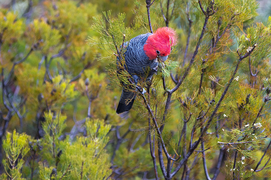
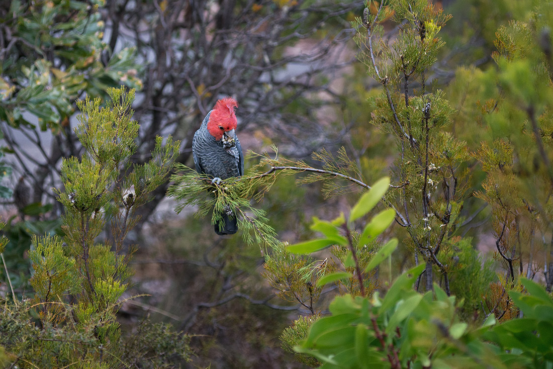
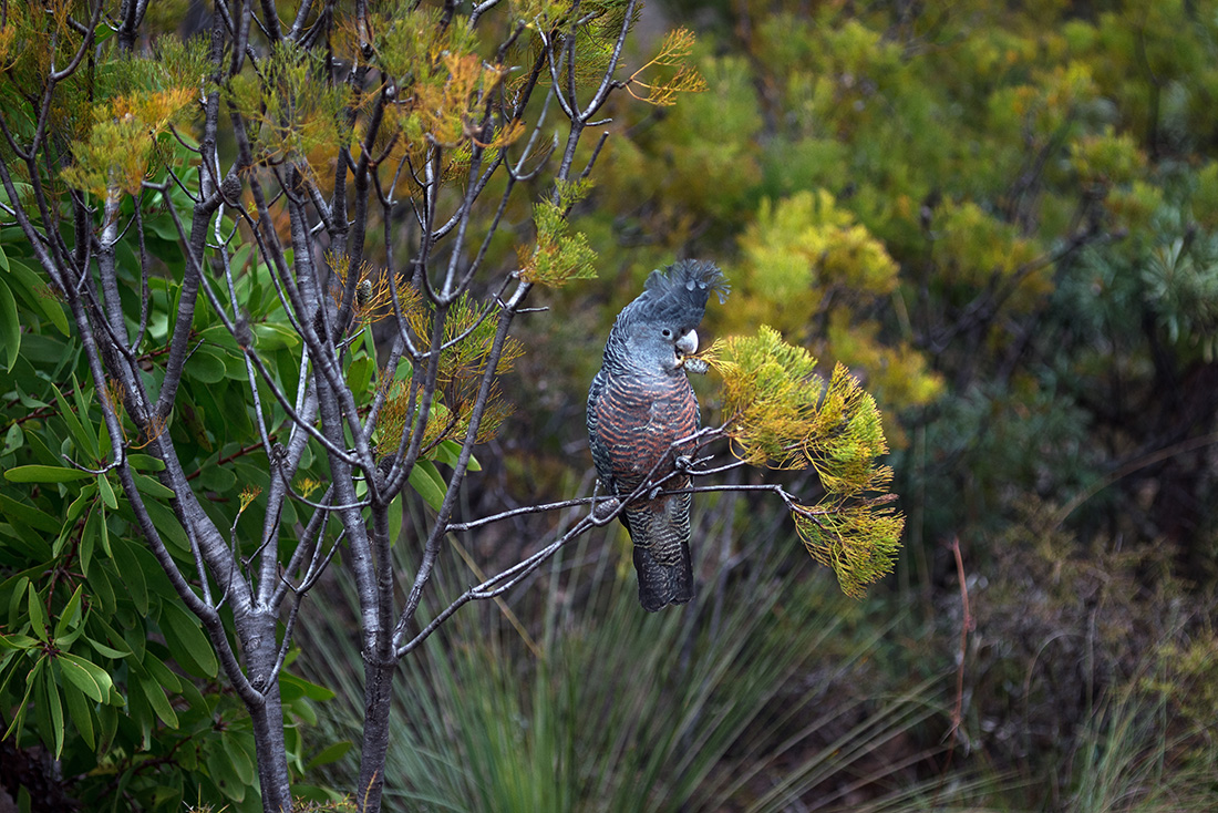
Gang Gangs make an appearance
I was lucky to see this pair around the property this morning. In fact its been a couple of years since I have seen these cockatoos. They are native to the areas but not often sighted. They were together foraging on the local flora. I was able to get reasonably close - within a few metres without scaring them off. Both are crested but the male has the lairy hairdoo!

Back to small

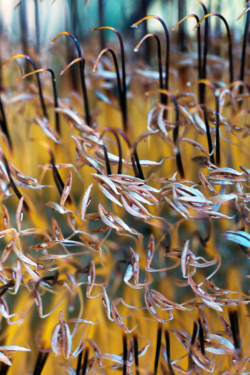
I almost forgot I had a macro lens. I'm not a macro specialist by any means, but I have seen some very excellent work, technically flawless, even if the subject matter wasn't my taste. You can see a range of techniques online that include reversing lenses and securing them with gaffer tape to home made macro lighting setups that do a great job. Hats off to the ingenuity of some very creative photographers. There's not much that hasn't been explored out there in the world of photography whether in methodology or subject matter. A designer friend of mine was mentioning the work of a German photographer from early last century. - Karl Blossfeldt. He put together his own camera and took photos that showed the natural patterns inherent in the structure of plants. Seen larger than life, macro shots impart something extra to objects often found around us that are mostly overlooked in our daily routines (isn't that what photography is about anyway?). Well despite being a blowy sort of day, not the best for macro shots where a still subject is usually required, I took the macro (Zeiss 120mm Planar on the Nikon D800) with a couple of extension tubes around the property where I'm staying. Below are a couple of colour and B&W images.
More texture
Not quite sure why I didn't get around to posting. Water stains can provide for some interesting images along the coastline. Especially the second shot, which gives the appearance of rock art with an aboriginal sitting by a camp fire.
Atmosphere
I didn't have to stray far from the track for this shot. Taken in Tasmania on my last trip. This is one of those images that makes it as a colour or b&w. In this case a warm toned conversion. Perhaps it adds a little to the ancient feel and mystery of the landscape.
Form and symbology
The photos that most engage me are those that have some meaning or tell a story or are symbolic in some fashion. If they need to be explained then the viewer won't have the mindset to appreciate it in the same way. Well we all appreciate different things or even appreciate the same thing differently! Specific cultural perspectives will throw up a variety of art forms which other cultures may not be able to 'consume' easily. Symbolism is often rooted in religious beliefs and image types vary from culture to culture. Anyway, after all that, here's the offering. Some other shots from the day will appear on the site in due course.
Return to Tasmania
Its been a few years since I stayed in Tasmania so it was with a fair bit of enthusiasm that I returned there to attend a wedding. It happened to be in Cradle Mountain a well visited tourist and trekking location in north-west Tasmania. The event was held outdoors with the accompaniment of some all too familiar drizzle and occasional shower. I made the most of the day by wandering off for a while through the surrounding rainforest after the event. A couple of my favourite shots are included here.

Another beach day
After being tormented by weeks of heat and humidity we were treated to a significant drop in temperature, a severe thunderstorm and local flooding. I did see significant sand dredging along the coast and plenty of rubbish left on the shore, spewed out by storm water drains. Not much fun swimming in that mix so wandered around the shoreline instead.
An afternoon on the James Craig
For several years the James Craig sat across the bay in Rozelle getting refurbished or whatever the word is when old ships get a facelift. A few of us enjoyed an afternoon aboard in its new Sydney home of Darling Harbour with a view of some famous city landmarks including Sydney Tower.
A quiet stroll...
A couple having a walk by one of the big waterfalls in Iceland - Detifoss perhaps. One thing that strikes you as a visitor to this and many other scenic spots in this country is that there is a conspicuous absence of railings and warnings of obvious dangers. The second thing is an absence of people taking material advantage of visiting 'crowds' by setting up kiosks flogging trinkets and other worthless memorabilia. Just seeing places like this is unforgettable isn't it??
Spring
Too bright and sunny for most types of photography. So, here's a shot of of an Eastern Spinebill just off the back verandah enjoying spring nectar.
Mythical Sea Wolf
This shot was part of the recent coastal photo shoot. I wouldn't print this image since I played around with it in PS. Well not the main subject but peripheral parts which were edited out or touched up in some way eg, removal of intruding plant on left. If I wanted to print such an image I would reshoot it to make sure I could isolate the subject sufficiently. I'm not really a PS afficionado so I don't want to have to create an image using tools. But I also think minor retouches are acceptable. To me, for an image like this, there's not much difference between moving a plant by hand or editing it out in software later. If it were covering the subject itself however, you wouldn't have even 'seen' this shot.
Below: Dinosaur & mole
Dissolution
Thought I would squeeze in a biblical reference. I thought of it when I was processing the first image. Always adds a little gravitas. Couldn't see any biblical characters among the 'smoke and clouds' but the flow of light and dark bought to mind creation, destruction, flowing robes, end of days and the like. I kept the warm tone in the processing even though no flames are visible. Amazing what you can see in a picture. I tend to let my imagination go with these abstracts. One day I'll have a shot at painting something like this.
Portrait format
I have to say, I don't really like the portrait orientation of 35mm format. It seems way to long. Current photo on display is one of the exceptions. Most of the time I'm finding I want to crop the image as a first step. This post was instigated by the fact that portrait format photos don't display on my site when mixed with landscape format images. Well they do show but get cropped arbitrarily. As a result I have left out many good shots. Even those I have cropped somewhat are further cropped by the template (which I happen to like). You don't know that till you start trying to load all your images and come up with this glitch. This image happens to be a favourite of mine taken in Udaipur, India c2005. The water reflecting the building is Lake Pichola which many years is dry. Even here its not so deep as you can see patches of grass on the surface. Anyway, I don't use this orientation much at all but given that this image has been very successful for me I suppose I'm going to have to live with the format and find a workaround.
Inspired by...
There's a photo by Peter Dombrovskis called "Deciduous Beech In Winter, Cradle Mountain – Lake St Clair, Tasmania" which was the subject of an article describing the creation of order from chaos. In large part its often what we attempt as photographers quite often with varying levels of success especially where we are faced with photographing a detailed landscape. I went for a short walk today with a friend to this wooded area and used the word chaos in describing the arrangement of trees on the other side of a creek. Although chaotic, there is a beauty inherent in the scene which required translation. The scene is dominated by the two trees at the front and my eye is drawn also to the change in colour of ferns and grasses as the trees disappear into the background. In the foreground a fern makes a cameo appearance. Finally, I chose a square format as a 'container' for the image. I find this format quite powerful, if that's the right word. This was my attempt. As a bonus, one of the resident kookaburras posed for the following portrait. He also got the square treatment.
Reviewing your work
Who doesn't like getting home after a good day's shooting and going through their images. For me its mostly pretty late in the evening by the time I get back tired and hungry. But that urge to get a sneak peak is irresistible. Have I got anything half decent? Did the ones I thought were on the money turn out as well as I thought? If we are now using digital exclusively, apparently we need to spend more time in considering compositions before releasing the shutter. I'll agree with that. Less is more unless you feel compelled by circumstances, light for example to make hay while the sun shines. Even so, rushing your work will rarely yield a satisfying result. It does happen that the shot I thought was the bomb ends up being a little ordinary while another less considered image surprises us with unexpected appeal. Also, have you ever noticed that the image on the rear of the camera looks amazing where in reality, viewed on your monitor its rubbish or close to it? What were we fooled by? Going a step further, the image on the monitor looks great but the print is somewhat more ordinary? The more time we allow before printing the more considered our opinion becomes. We might even decide it doesn't warrant printing at all. Looks like we had the photographic equivalent of 'beer goggles' on. There is all sorts of in between on this topic as well. The image I was determined would work as a b&w doesn't meet expectations. With all the experimentation we can do, once it goes to print, that's the end of the road. You can make a judgment. It seems while things can be changed and adjusted we reserve our judgment. But its good to sit with an image for a length of time to see exactly how we feel about it. I once painted my wall grey and strung wires across it to hang small prints there for weeks sometimes just to see whether I really did like the shot. Before that when I had plenty of paper and ink I would print things that I later judged to be very ordinary. Apparently, a lot (close to 80%) of people in their early stages of photography have never printed an image! An inexpensive way to assess your work is to go through the motions of publishing a book. When you set out the pages and 'leaf' through it, see how you feel about it. Can you recognize a weak image? Its always good to get a second opinion and not your mum's! I've found that to be the most helpful approach to assessing my work. You may be surprised about what other people like. So I posted the above image to illustrate something. Going back and reviewing previous work. I have only printed this as a b&w because I saw it as that at the time of making it. There's no doubt for me that it works as b&w but I now appreciate it in its original colour form as well.
Just waiting
Yesterday was still cold and wet but I thought it might be worth a drive. Didn't return with that much but a pleasant day out nonetheless. This swamp wallaby wasn't particularly bothered by my presence even after I got out of the car to get a better shot.
Do I convert?
This is not a religious proposition but a reference to the black and white option vs colour. I've spent a lot of time in and around the ocean and find the the mix of colours and textures which includes the rocky surrounds a drawcard that's hard to resist coming back to again and again - with or without a camera. For the most part, I don't convert any 'wave action' shots to black and white simply because the colour of the ocean and the light through the waves provides so much variation and depth that converting to greyscale somehow takes the essence out of it. You don't see holiday posters of idyllic locations in b&w. The b&w rendition has the effect of breaking the familiar emotional links or associations we have with the scene. Additionally b&w photography is not so much about vistas or photographing familiar things in a familiar fashion. There is more ambiguity in b&w for this reason. And for the same reason photographing in b&w can be more challenging.
So, it really comes down to the translation. I have many colour shots for example from India which give a flavour or subtlety to the image that is not there when viewed as b&w. India is that kind of place. Colour enhances the character. I would imagine that African images would give a similar result, especially in a rural environment. Example below...