

Descriptive in different ways - I use the word ‘story’ very sparingly in relation to photography. It can make you sound pretentious especially when you don’t have a series of images that work together. These two images though show why I shoot both colour and B&W. Especially with a limited colour palette as this bottom image shows, the yellow gold can lift the image where absence of colour would not give the image the same appeal. It may not be the most striking image but it illustrates the point. And you can see why and how too much colour in an image can detract from your subject of the image as a whole. Which is why, in many instances, if not used judiciously, colour weakens your image. B&W just tells the story in a different way.
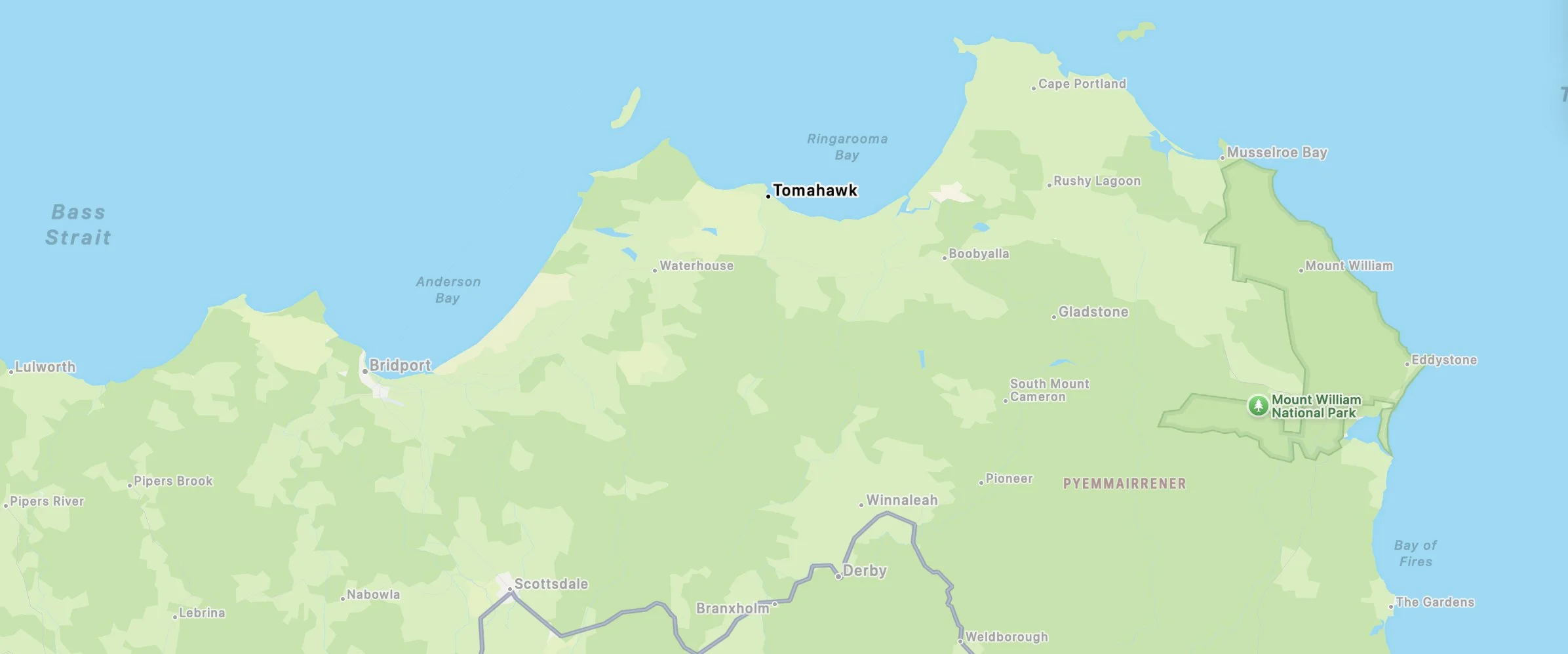
XPan beachscape - Tomahawk, Tasmania
horror movie tree
Approximately 11 trees
Nothing much else to say about this imkage.
Inscrutable cat look
Couta rocks
Seaweed variety in a quiet bay area not far from Arthur River.
Sand sentinel
First light
I took a detour after coming off the ferry from Victoria and arriving in Tasmania at 6.30am. As fortune would have it - great timing for this scene. Intriguing with the shed with no doors. A great angle from the street. Sometimes nature does the trick, sometimes humans. In this case, both.
Not far from little fergy...
Even this sheep appears confused. Who is this pink haired lady?
keeping the detail
This photo tested the dynamic range of the Fuji GFX100S. It produced the next best thing to a fog or mist in a scene. Early morning and strong light coming from the sunrise. Distant background shows some detail but the clouds all but blown out. Histogram shows full recovery of the highlights but obviously nothing visible in the cloud mass. I don’t thing there was much to see with the naked eye.
Little Grey Fergy
Tasmanians or Taswegians are given to ‘animating’ their letterboxes by turning objects into same. This is slightly different, Little Grey Fergy refers of course to the brand name of tractors - Massey Ferguson. Don’t know exactly why they have elevated its position.
A little bit of ambiguity & geometry
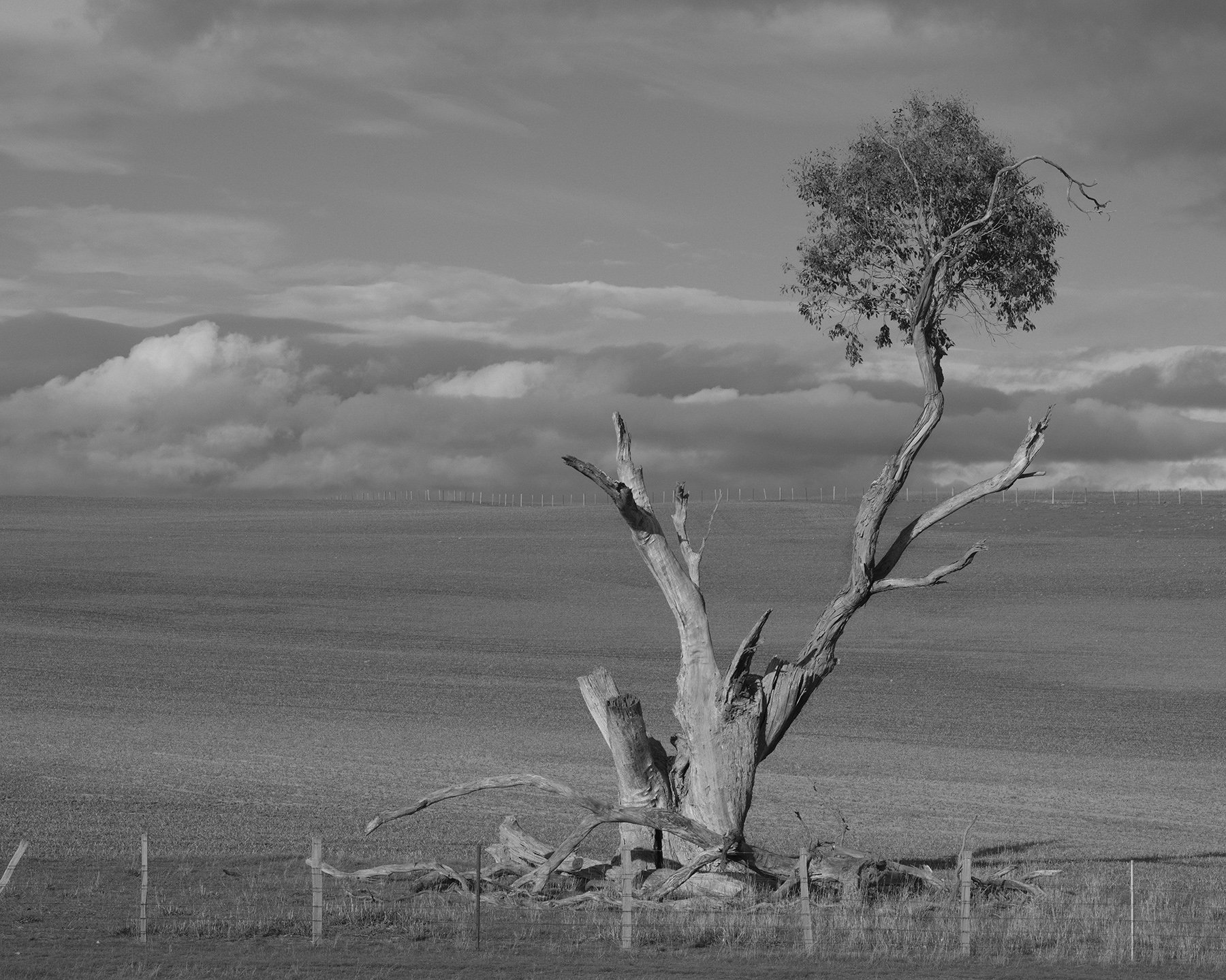
I purposely did not apply auto contrast since I’m quite happy for the subject (tree) to be exposed in this way. Clouds in the background are curiously lower than the mountains behind with not much tonal separation..
Continuing on...
Silvery green tones in muted lighting. Sometimes an outing might yield some ideal scenes without much effort. I’ve referred to lost opportunities to capture images because you simply can’t stop to capture the scene - in a line of traffic, no stopping place, can’t get close enough due to private property access or some other reason. If you’re not alert, you might pass a scene and think later you should have made some effort. In that time also conditions can change. This river scene was viewed from the car passing over a bridge. I was determined to get a closer look despite not being able to easily park nearby. Walking onto the narrow bridge was also a challenge with passing cars. I felt it was worth it though. I generally like to take routes that are away from major traffic highways - just so I incur minimal wrath from passing motorists. I’m usually rewarded.
cat or car
I don’t own a cat, or an MG for that matter. She didn’t mind posing though if you were quick enough. I have never worked out why people in the country have such an obsession with broken down vehicles. You can see them hidden in bushes, on blocks laying about the property. This particular place had at least seven of them, none of which were remotely driveable.
escape from...

Dead trees have a certain appeal to me. Too much really. I think it stems from the early days of my photography when I found them to be ‘easy targets’. I’m gradually getting over it. Nevertheless here’s one where I waited for a herd of cattle to pass, creating or rather adding to a perceived sense of movement. This is what might pass very loosely for a story. Hence the gratuitous title for this post.
bull and tree

Meandering through the countryside can offer good ops for photos. As mentioned previously I always seek out the longer route to any destination where there is one. I have several of these animal ‘portraits’. The blank canvas of the grey sky background serves these kinds of photos well.
subtle textures
I’m not one to advocate for going to exotic places for photography. It is is useful at times to find a place where people don’t get to so much. Tasmania is an ideal hunting ground for relatively untouched locations where there is not that much evidence of human occupation. Which means you can find beaches where you don’t have to negotiate around the movement of others, footprints in the sand etc. Just be careful of your own.
Out of the woods
Despite all the debate that’s gone on around photography - is it art? One reference that comes up again and again is the fact that some photos don’t look like photos. Or maybe that they have a painterly feel. I do feel drawn to those types of images. Is it because they don’t rely on the cliche of postcard type of images with their bright sunsets and oversaturated nature scenes? Yes, to a large extent. For years I’ve been chasing the colour style that doesn’t represent modern digital photography. I’m fairly happy where I’ve landed with that. Muted tones and subtle lighting reminiscent of some artists from the mid 1800s add to the painterly effect.
When I first began seriously with photography, I noticed that scenes that landscape artists used to paint were not what most photographers that I knew were interested in. Everyday farm scenes or somewhat undramatic landscapes with soft lighting. This is not what camera companies are promoting after all. Fuji and others have thrown out a wider net by providing a variety of colour profiles or styles. Applying an appropriate style to a particular image is another challenge. It may be late in the day, but I would still like to paint some of these images by hand.
flower in the window
Visits to the city these days are few and far between. I bought a 17mm TS lens many years ago to use with the Canon system which I have since sold. Although I used it for work, I would have liked to explore a little more for personal stuff just walking around town. Not to be. Although architectural in nature, the big flower in the window is a big feature of this image. I took it in passing but love the mix of colours and shapes.