Stockholm, Sweden 2005
Little Michelin boy
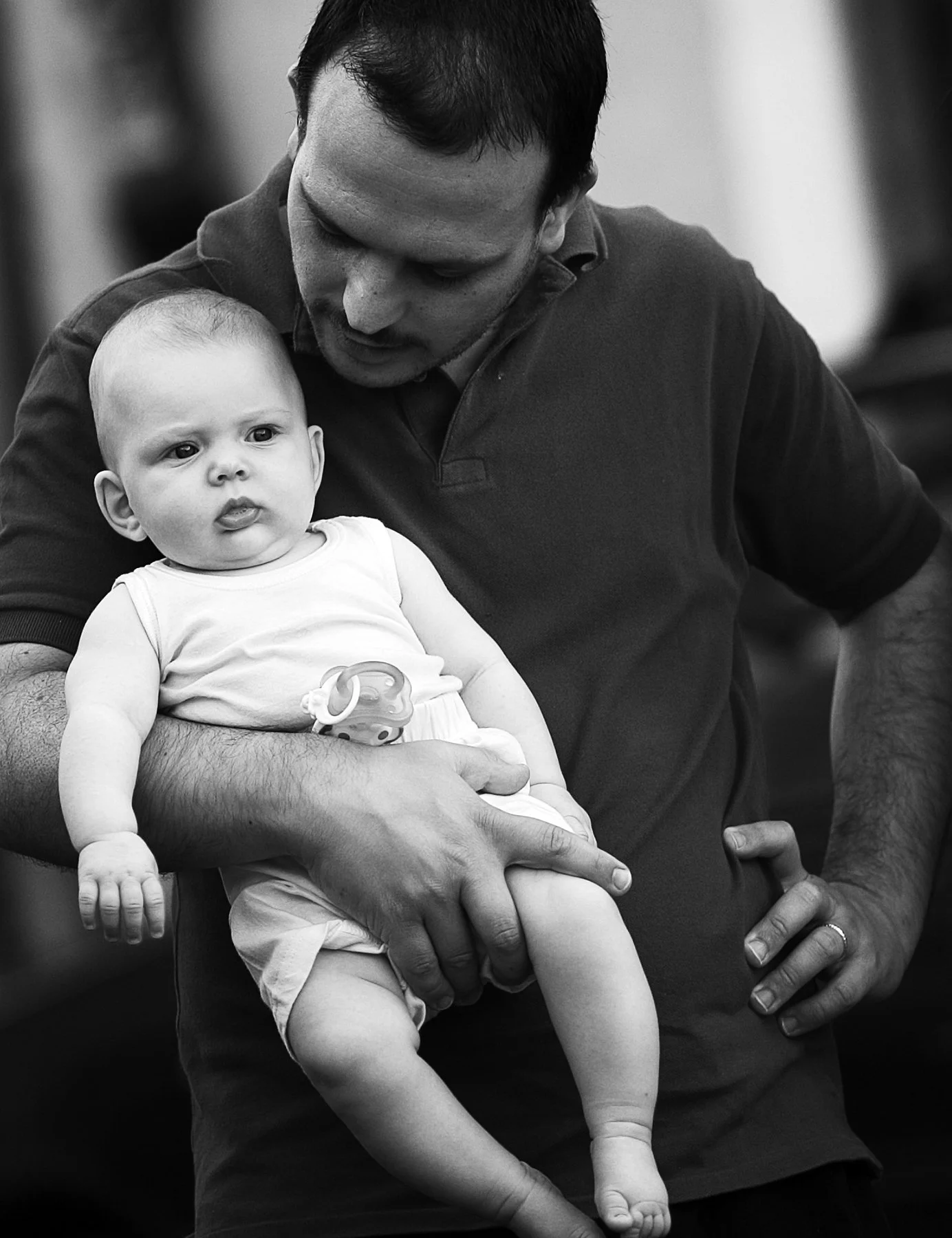
Father and son, Rome
old lady and pigeon
I have said I’m not a fan of 3x2 vertical images but I couldn’t lose the pigeon from this shot. Rome.
My Humble ode
Nuns in Rome
If you’ve ever been interviewed as a photographer (I haven’t), one question they like to ask is - Who are your influences? In other words which photographers, past or present have shaped the way you approach your own work? Well I can say which photographers I like but they haven’t necessarily influenced my work. In many cases they exist in a different genre. If you’re into photography as art, and by that I mean if you aren’t necessarily trying to create perfectly toned or coloured images according to the expectations of most people and just using your camera as an artistic tool, then I’m going to recommend an obscure artist from last century that I find immensely inspiring. After seeing his work you might like to reappraise your own approach to photography and maybe take a few more risks.
Another question it raises is - Can you teach ‘vision’? It’s a great example of someone whose art was informed by his previous life - meaning that of a typesetter. A very black and white background. Looking at his work you can be forgiven for thinking you have been living under a rock or at least in a very small box. Here’s a guy who didn’t care who else was doing what. He had his own vision and followed just that. Definitely food for thought.
The Photographer Who Hated Reality | Mario Giacomelli's Black & White
Copy the link. https://www.youtube.com/watch?v=CeEVhyjW8Ag
apricot girl
Taken walking through a market in Rome. After noticing her she offered a piece of fruit - days of innocence.
restaurant busker boy
Love this kid’s beaten up old accordion. Can’t remember if any sound came out of it. Circa 2007 - Rome.
abstract layers
I had a friend (art curator) critique this image which became very popular as part of a series of photos comprised of multiple photographic images layered upon each other. Very few if any were just multiple exposures. Most had between four and ten layered images combined with varying levels of transparency. The result of the process was the emergence of shapes and forms not existing in any one image.
“The work reads less like a record of places than a carefully constructed visual meditation on perception itself. By layering a desert landscape with a shimmering waterscape, trees, and filtered sunlight, the artist dissolves any clear boundary between terrain and reflection, reality and reverie. Although the image is lit with a cool, lunar ambience, it never feels cold; instead, the moonlit atmosphere softens the scene into a hovering dreamscape where time appears suspended. Most compelling is the barely discernible face emerging from the water — not photographed directly, but assembled through the accumulation of overlaid images — which lends the piece a psychological depth that feels both intimate and elusive. This subtle apparition transforms the composition into a different narrative of presence and absence, leaving the viewer with a lingering sense of mystery about what is being revealed and what remains deliberately hidden.”
Collapsing beach
Taken near the shoreline - Bronte beach, Sydney, soon after a storm.
Cliff Face

Some time last year I invested in some presets as I often noticed that my images were toned slightly more towards the warmer side. For my taste it didn’t suit the image in many cases. The presets I downloaded featured some well known film stocks of yesteryear. I’m not dissatisfied with those but I’ve developed an interest in adjusting colours to suit my own vision. As with many edits in photography, it’s advisable to allow your adjustments to ‘stew’ for a while. Meaning leave them and come back after hours or days and review your work. In this instance I haven’t taken my own advice, at least not with this image. I will review it though down the track. For the moment, the colour grading is to my liking.
Another factor not mentioned yet but which I’ll talk about in a subsequent post is ‘second base ISO’. You can do a search on that to see how it might benefit your own work. Back to this edit for a moment - I do see an opening of the shadows compared to the original Raw conversion. The extra detail is a plus.
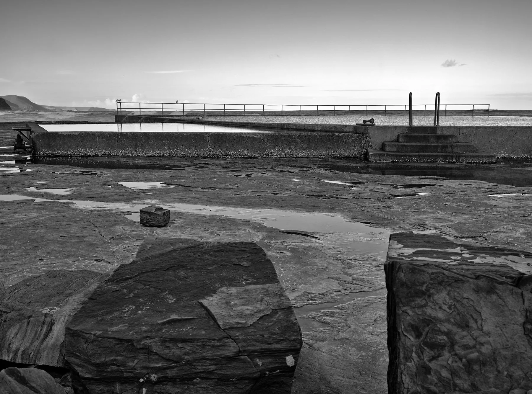
Two pools
Rock pool - wombarra
Art on the beach
Quick artwork on the beach today.
Flowers Pods and mist
This image was taken several years ago with a Nikon D800 and a (Zeiss) Hasselblad 120mm Makro lens as far as I can remember. Most of the fog/mist in the mountains occurs in the warmer months when there are more significant variations in temperature. Australian waratah in early bloom.
The Vine Challenge
If I had a tripod I would have been able to capture a little extra sharpness and detail in the vine. As it is this shot is at f16. Focus stacking would be the go really. It’s possible there was a slight movement of the tilt mechanism due to which some sharpness was loss on the RHS. If the movements of the tilt/shift adapter are not properly tightened, then due to the weight of the lens, I’ve found there is a bit of slippage with a portion of the image falling out of focus. I’ll look for another opportunity to get back here.
Carrington Falls
Yes, it has been all quite on the photographic front. Other activities taking precedence. Although not readily visible from this image, the weather turned grey and rainy within 3 minutes of taking this image. A few things to mention about this: In PS it has a lot more punch. Not sure what’s going on with the ‘translation’ to the website, but the colours definitely took a hit. I love the Pentax 67 55mm on the Fuji but it suffers a little from colour fringing. I didn’t do a great job in the adjustments (left top portion). The waterfall itself is twice the height shown but I find this crop highlights some interesting detail of vegetation and rocks.
Big ol' trunk
I processed this image after a walk through a rainforest last year. I’m loving this conversion in particular having already worked this image with Nik Silver Efex. This film sim though, provides a look I was not able to see in the first attempt. It’s Ilford’s HP5 and gives a beautiful 3D look into the background where the highlights are well maintained.
Separation anxiety
One of the reasons you may not want to convert your image to BW is because you may not be able to achieve the separation you want of the elements in your photo. The leafy plant in the foreground is an example. Although the highlights do draw your attention somewhat, the majority of the plant disappears into the background. In some images that may even be desirable but it’s a danger if there are too many similar tones that the image remains a little too two dimensional. I played around with the colour a bit in this image - it’s a combination of one of Fuji’s sims (maybe Classic Chrome) plus Fuji Pro 400H and Porta 400. Sounds more of a mish mash that it probably is but I suppose that’s the beauty and flexibility of PS. Everything can be ‘salted’ to taste. I’m also liking the colour reflections in the water.
Close enough?
Previous posts have shown several X-Pan images taken on the Fuji GFX 100S. These elongated or pano images show a unique view of the world taking in so much more of the environment - apparently. Dedicated Hasselblad X-Pan cameras do this naturally. The current crop of ‘medium format’ cameras have this format as an option in a 65 x 24 aspect ratio. Older film cameras like the Pentax IQ Zoom include that option. Blowing up a portion of 35mm film however came with it’s limitations of size and quality. That’s obviously not much of an issue with medium format as there is plenty of pixels to play with.
If you’re willing to work with your framing skills, there is another option if you don’t want to fork out for such an expensive setup. Some years back, when looking for a street photography option (lightweight) camera system, I bought an Olympus EM5 MKIII (available on the Bay for around US$700) and a Sirui 35mm f1.8 Anamorphic lens (also available on the Bay for just over US$300). Both of these are gear in very good condition.
Results? Olympus colours OOC are excellent especially for nature images. The examples above have been another of my favourite film sims Fuji Pro 400H. This is a beautifully sharp lens. The final image size is a very decent 60MB. Its not exactly the same dimensions as the X-Pan, coming in at 65 x 28. If you’re being picky, you could crop the short side by a bit to get your 65 x 24. If you wanted to go wider, there is also the Sirui Anamorphic 24mm f2.8. Both are excellent choices. Although these lenses have traditionally been used for cinema, they produce excellent still images.
Replaced image. This B&W conversion preferred.
Beachscape #2 & Photoshop story
X-Pan images from the coast on a recent outing.
Scarcely a week ago I swore off PS and other Adobe software due to ongoing costs and not making much use of some of it like InDesign ($35/month). I could live without ID as there are viable alternatives. PS however presented more of a problem partly due to not being that familiar with other programs on offer. There are mixed reports about Luminar Neo for example. I want bother giving the details here but as it turned out Adobe offered their whole suite for the same price as I was paying for 2 apps that I needed. I noticed this on the final day of the sale. Thus, I went back for a second bite at the cherry. PS has a lot of refined elements that are not available even in LR. Small things that make life in the editing chair a little bit easier. Things I was very used to. So, the deal is only for 12 months. I’ll worry about it again in a year.
beachscape
Wind blown sand on ledge
Sooty Oystercatcher and rocks on beach